A leading real estate developer in Bengaluru, J R Housing has delivered over 16 million square feet of beautifully developed residential properties to customers spread all over India and abroad.
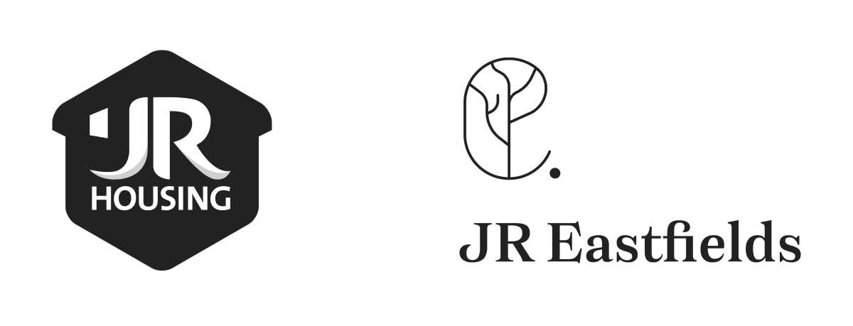
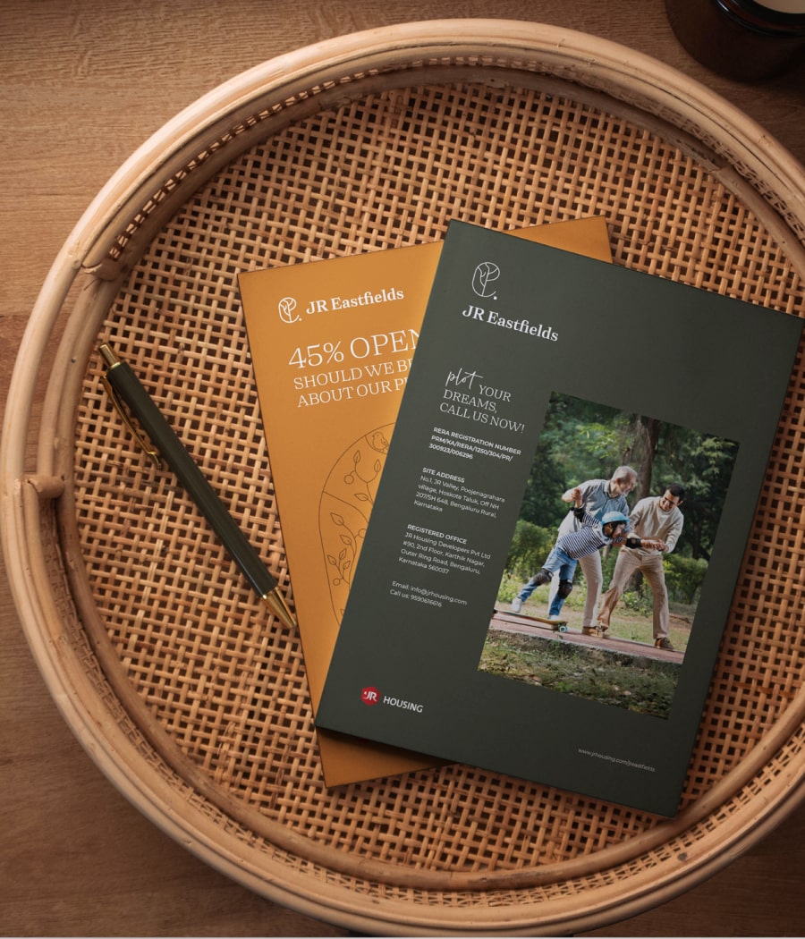
The client wanted the logo to represent stability, security and an aspect of family besides representing housing. The Hexagonal shape was inspired by the honeycomb and the bees representing familial values. The hexagonal shape was modified to look like a house and secure badge. The shape was colored to give a solid feel and the red rendered warmth of family.
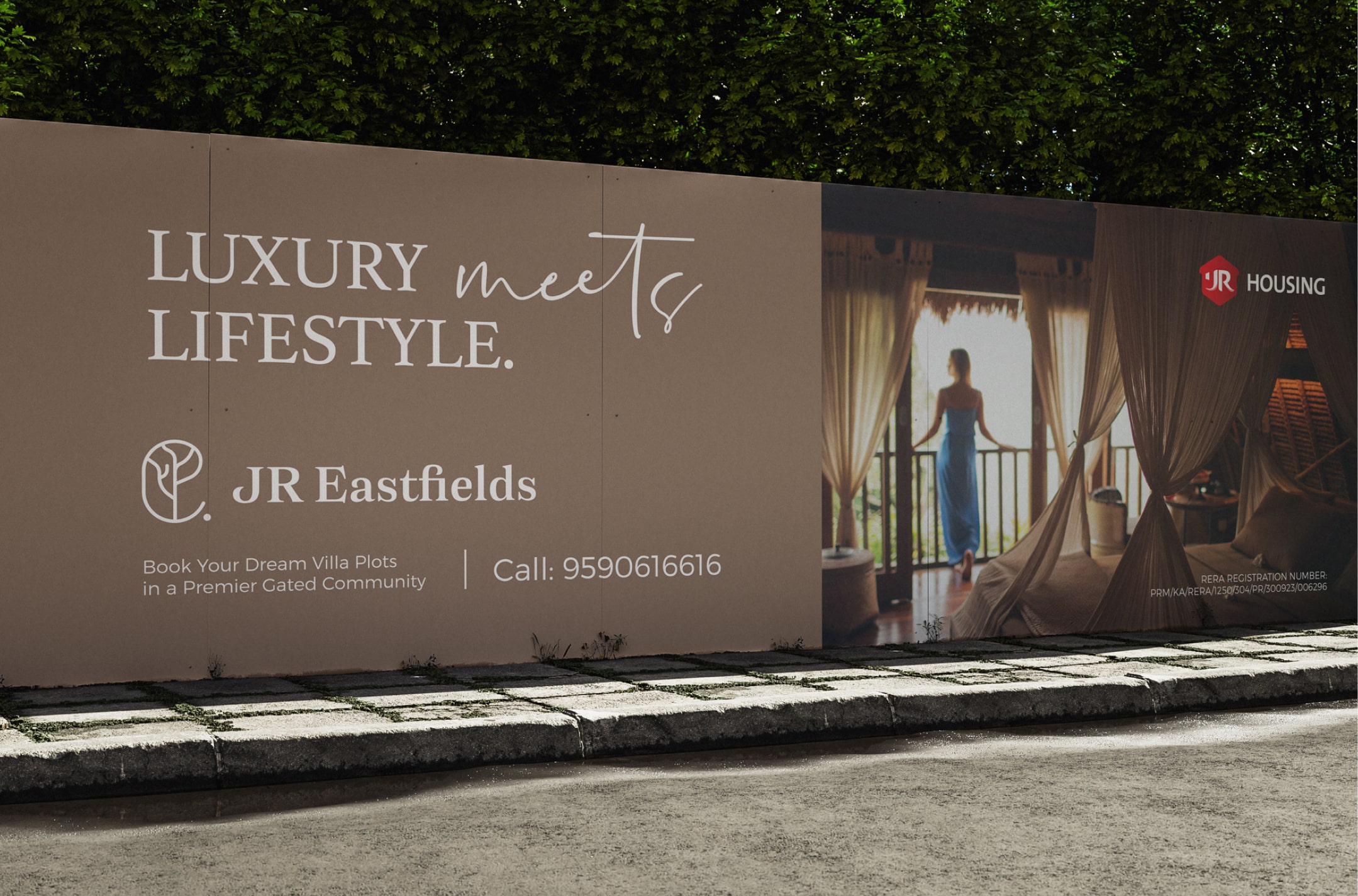
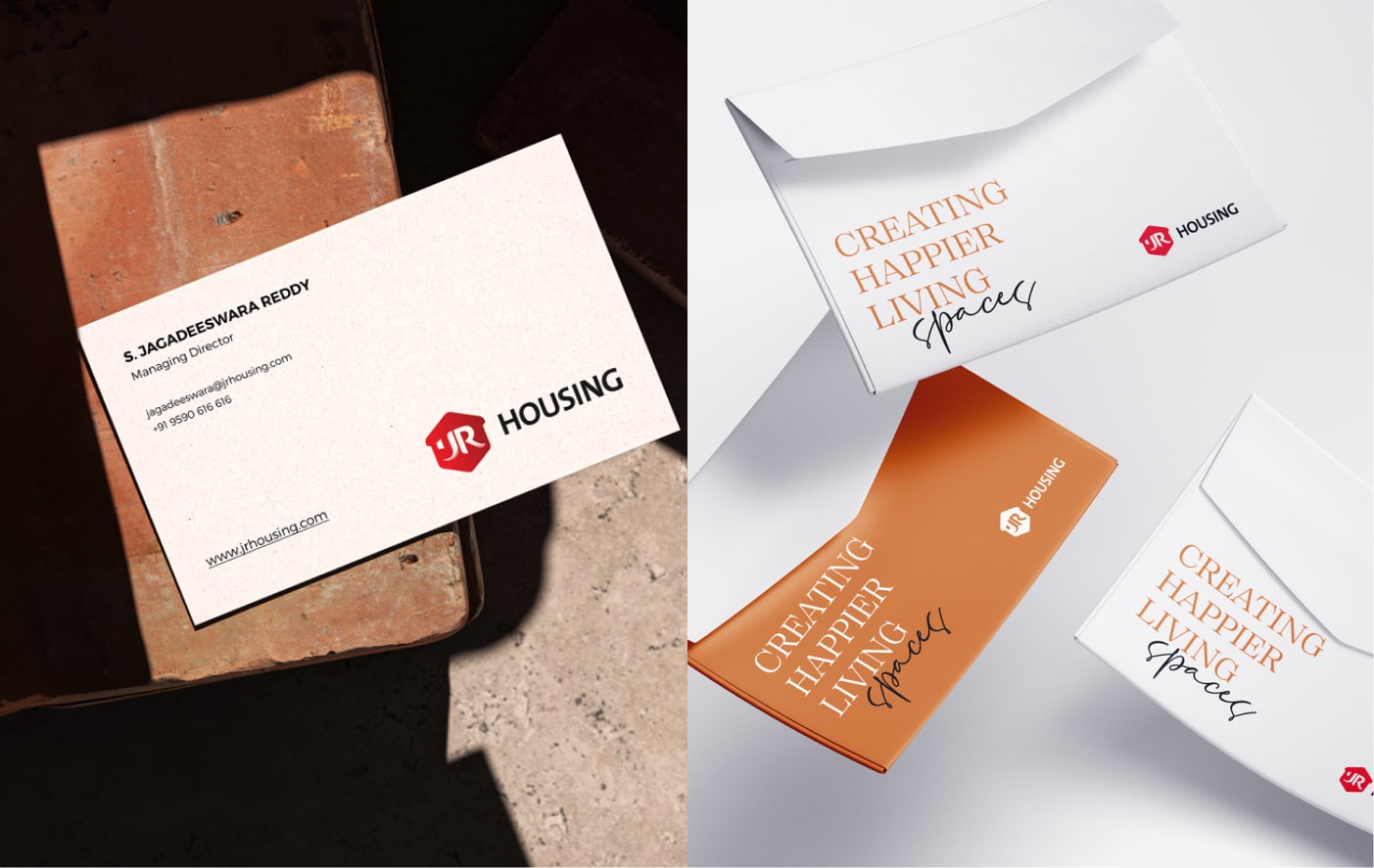
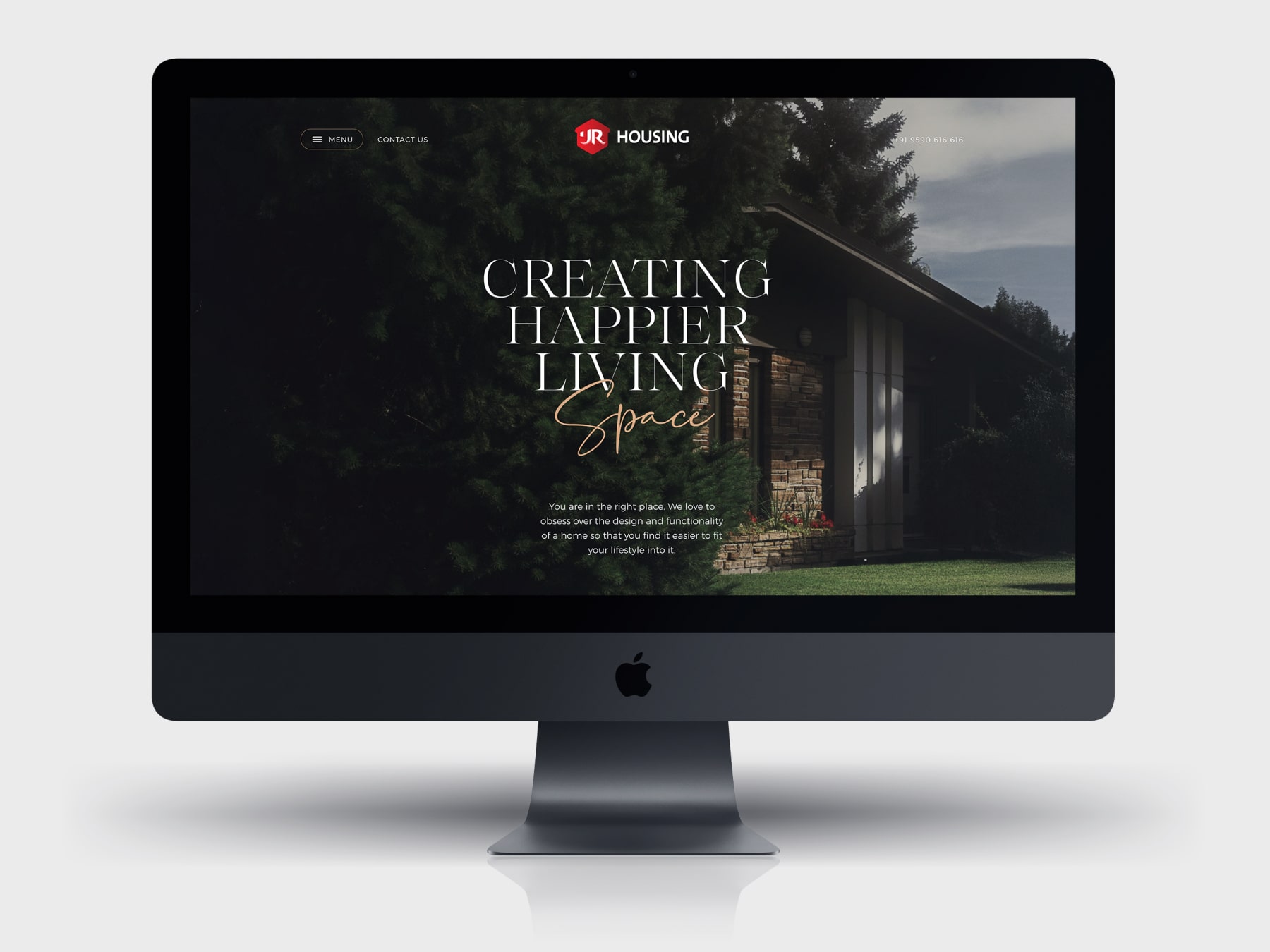
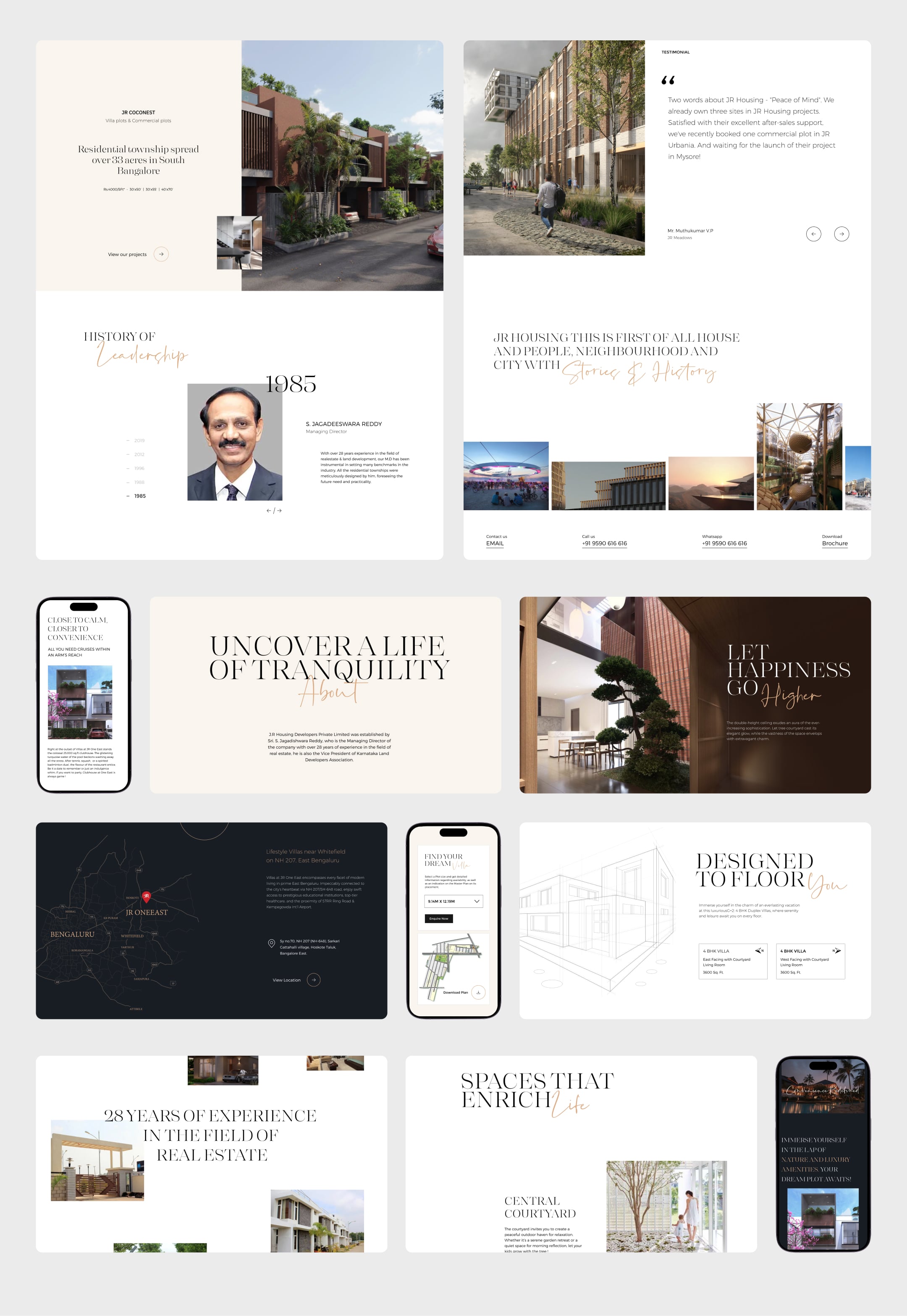
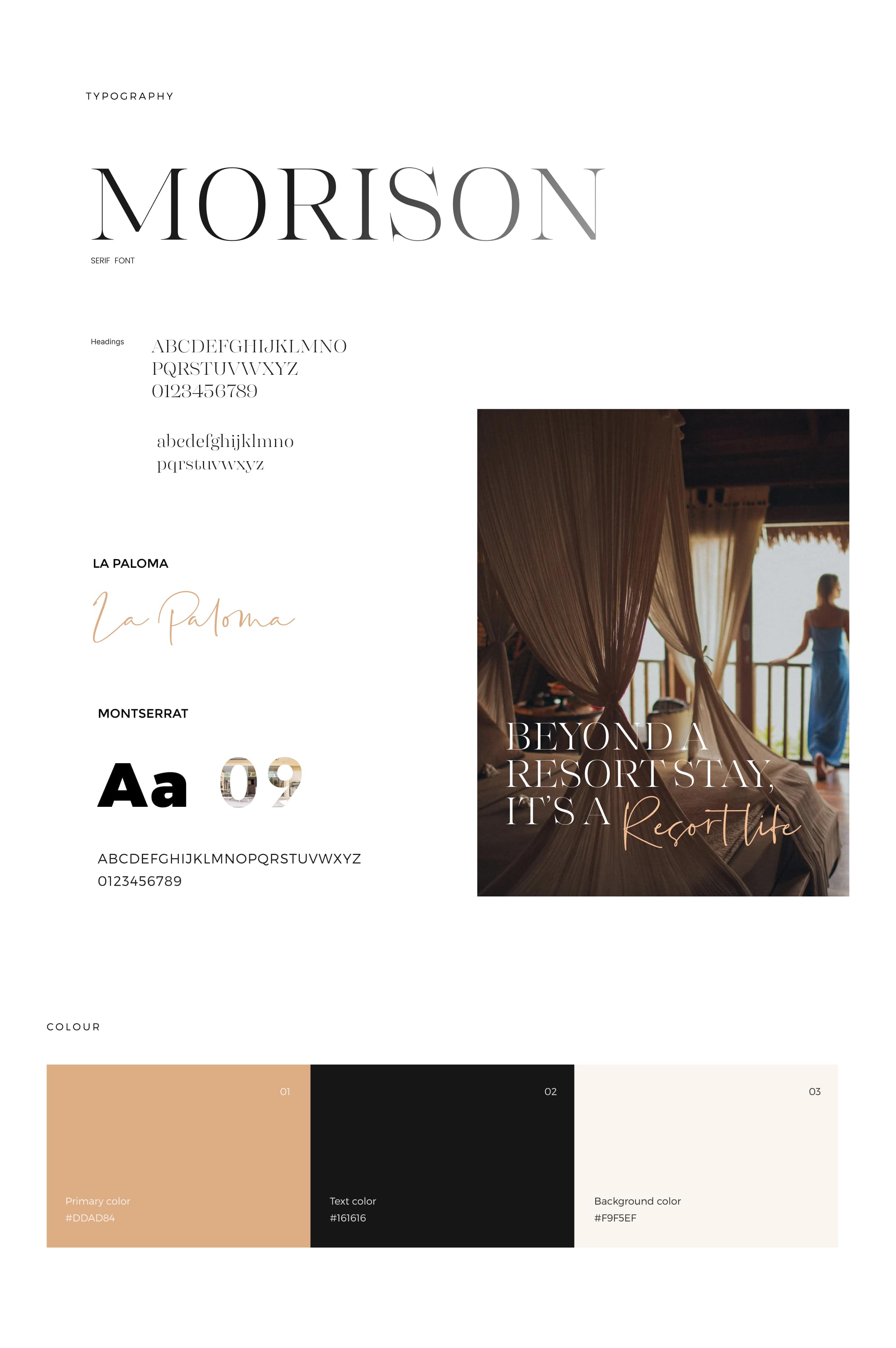
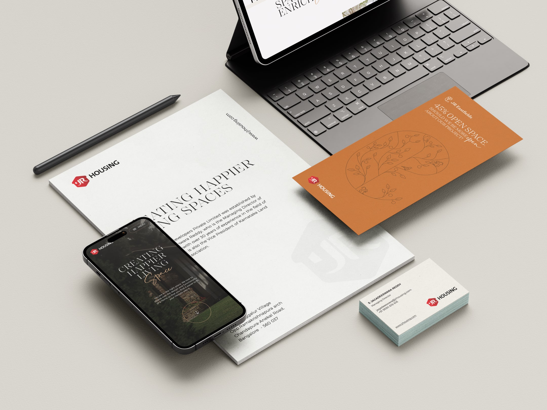
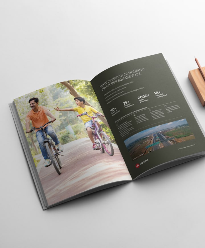
Typography and colors were chosen to represent warm and earthy tones that augurs well with the housing domain. Three typefaces were chosen – Serif, Sans Serif and Script, that represents the personality of the brand. The script typeface especially adds a personal touch and draws attention to the keywords in a statement.

Niranjan Reddy, Director, JR Housing